Turn Your Living Room into a Gallery Without the Price Tag

Welcome! Today we dive into curating affordable art and accessories for a gallery-grade living room, transforming everyday spaces with smart sourcing, thoughtful pairing, and confident display. Expect practical steps, honest price-saving tactics, and stories from homes that learned to look museum-ready without costly makeovers, proving style grows from creativity, not budgets.

Thrift and Estate Sale Strategy

Arrive early with a tape measure, flashlight, and open mind. Check frames, signatures, and condition under good light, and flip for labels or gallery stickers. Bundle purchases to negotiate better, and return often because rotation is constant. Keep a running wish list on your phone, including sizes and color notes, so discoveries align with your space rather than becoming charming but impractical acquisitions.

Online Marketplaces with Filters that Matter

Use saved searches and price caps, and sort by newly listed to spot deals before they vanish. Study seller photos for texture, paper edges, and scale references. Ask for natural-light shots to confirm color. Favor local pickup to avoid shipping costs, or combine shipments. Track completed listings for real pricing insights, then message politely with informed offers supported by comparable sales you’ve researched.

Local Artists and Student Shows

Visit open studios and end-of-term exhibitions where work is fresh, experimental, and accessibly priced. Speak with artists about process and care; stories deepen connection every time you glance at the piece. Follow them on social to learn about small drops, print editions, or seconds. Buying locally reduces transport costs, supports your community, and yields opportunities for future commissions perfectly tailored to your room.

Framing Like a Pro for Less

Thoughtful framing elevates even modest works into focal points. You can mix ready-made frames with custom touches to achieve a tailored look without the invoice shock. Understanding archival basics, scale, and finish allows prints, textiles, photographs, and found objects to feel cohesive and intentional, creating a polished presentation that stands confidently beside expensive, professionally framed pieces in any refined setting.

Composing a Wall That Breathes

Arrangement turns individual pieces into a conversation. A balanced wall respects scale, spacing, and rhythm, allowing strong works to anchor while smaller accents chime in. By testing compositions before committing, you’ll avoid patchwork holes and achieve a confident flow that guides the eye. The result feels effortless, generous, and calm, even when the collection spans different mediums, makers, eras, and price points.

Grid vs. Salon Hang Decisions

Grids deliver order and modern polish, especially with photographs or similar frames. Salon hangs offer storytelling energy and flexibility, letting you integrate varied sizes and mediums. Choose based on architecture and personality of the room. If ceilings are low, keep the densest grouping mid-wall. When in doubt, start with a loose grid and gently loosen it where asymmetry brings necessary movement and charm.

Anchors, Spacers, and Rhythm

Begin with one or two anchors—larger or visually weighty pieces—near eye level. Add medium works to build cadence, then pepper in small accents to bridge gaps. Keep consistent spacing measured with a template stick. Consider color rhythm too: repeat a hue at intervals so the wall reads as a whole composition. Step back often, squint, and confirm the energy is balanced across the field.

Color, Texture, and Scale That Elevate

Color Stories from What You Own

Start by sampling dominant hues from your rug, sofa, or a favorite throw, then echo them subtly in matting, frames, or accessories. A limited palette reads cohesive, helping eclectic finds cooperate. Introduce a deliberate discordant note—one contrasting color—to spark interest without chaos. Keep swatches handy when shopping so choices reinforce the story already present, ensuring continuity across changing seasons and small updates.

Mixing Mediums for Depth

Combine oils with graphite studies, risograph prints with woven textiles, or ceramic wall pieces with photographs. Surface variance catches light differently, increasing visual richness. Complement wall art with tactile accessories—rough clay, patinated metal, soft mohair—to echo textures horizontally. This interplay makes budget-friendly items feel intentional and layered, as if collected over years, while giving your eye multiple speeds to travel across the room.

Scale Games with Oversized Statements

One large piece can organize a whole wall, making smaller works feel purposeful around it. If originals exceed budget, consider engineered canvases, large-format prints, or fabric panels stretched over stretcher bars. Overscale accessories—dramatic branches, tall sculptural lamps—reiterate the gesture. Balance large moves with quiet negative space so the drama breathes, delivering presence without tipping into clutter or visual exhaustion over time.

Lighting That Flatters Without Overheating the Budget

Light shapes perception. Thoughtful layers reveal texture, stabilize color, and direct attention. Instead of pricey picture lights everywhere, combine floor lamps, adjustable sconces, and guided daylight to highlight key works while preserving comfort. We’ll discuss bulbs, beam spreads, positioning, and glare management, so pieces glow naturally and your living room remains a place to unwind, read, and gather as evenings softly unfold.

Layered Light on a Dime

Blend ambient, task, and accent light with affordable fixtures. A dimmable floor lamp sets mood, while a clamp light or puck light can graze texture subtly. DIY cord kits turn vintage shades into characterful sconces. Prioritize flexibility so layouts can evolve as your collection grows. Multiplying modest sources reduces harsh shadows, creating gentle depth that flatters artwork and people equally throughout the day.

Bulb Choices for True Color

Select bulbs with high color rendering index—90 or above—so pigments remain accurate. Warm white around 2700–3000K suits most living rooms, though cooler temperatures can benefit crisp photography. Avoid strong blue peaks that distort reds. Keep consistent temperatures across a wall to prevent jarring shifts. Replace dim or flickering bulbs promptly; small maintenance habits protect how your collection reads and feels nightly.

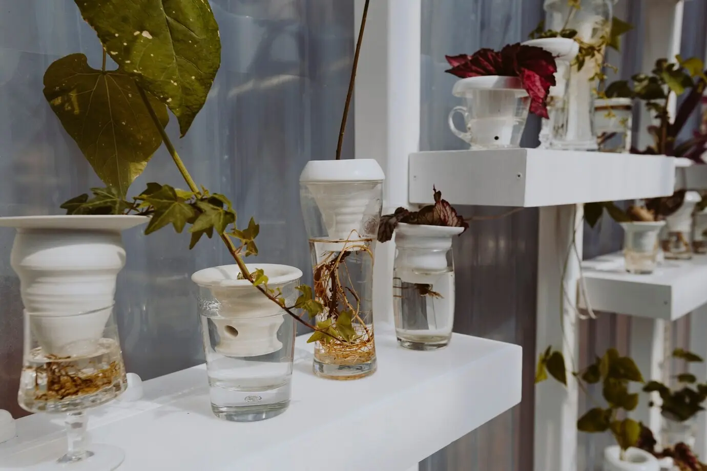
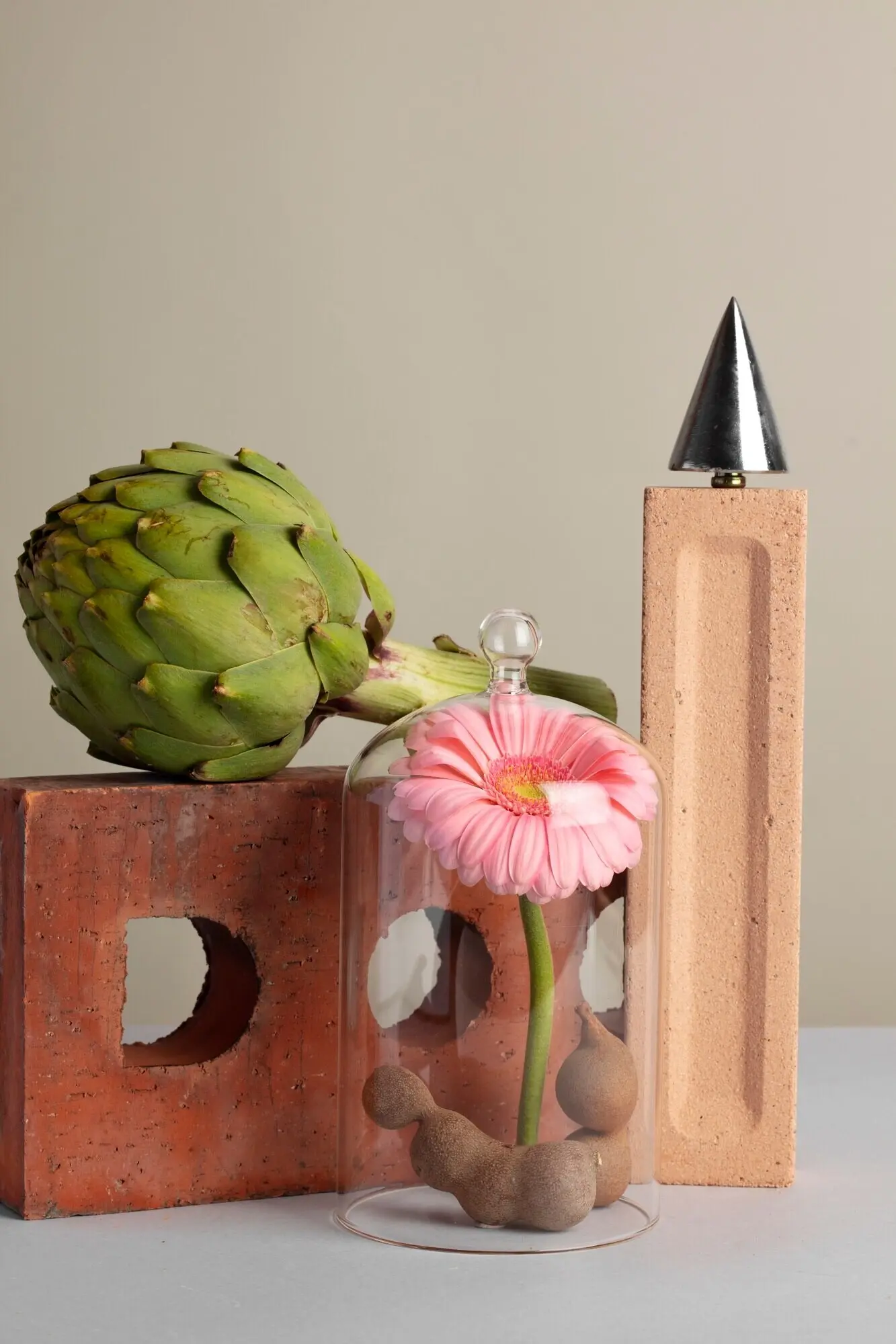
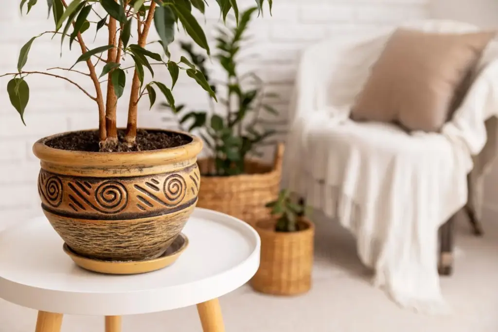
Styling Surfaces to Echo the Walls

What rests on tables and shelves should converse with what hangs above. Accessories can riff on palette, texture, and geometry established by your art, anchoring the whole room. Thoughtful groupings prevent visual noise while offering tactile moments. We’ll craft vignettes that feel collected, not cluttered, welcoming hands and eyes to linger without distracting from the overarching harmony you’ve patiently composed over time.

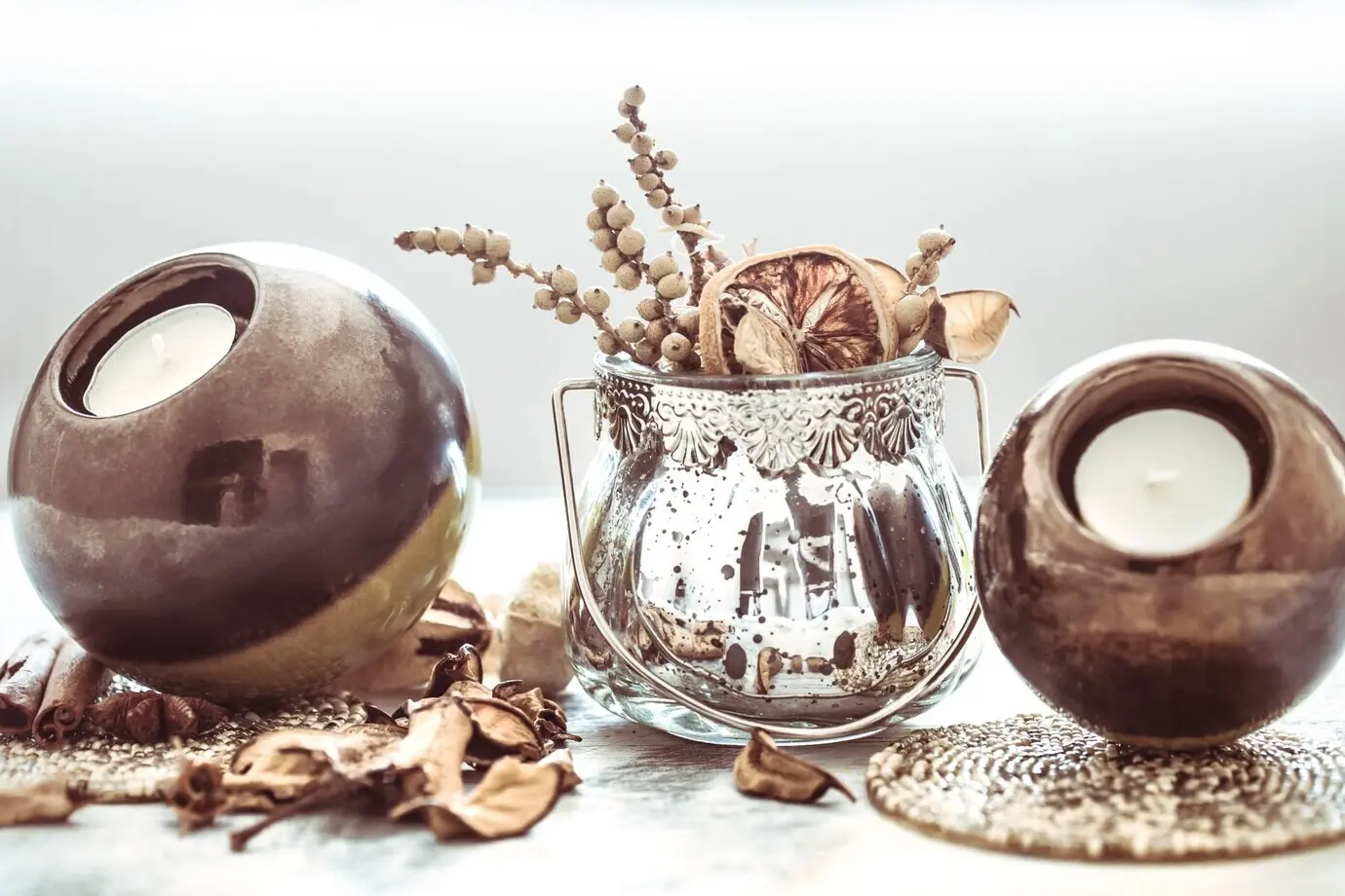
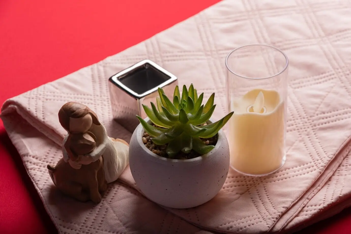
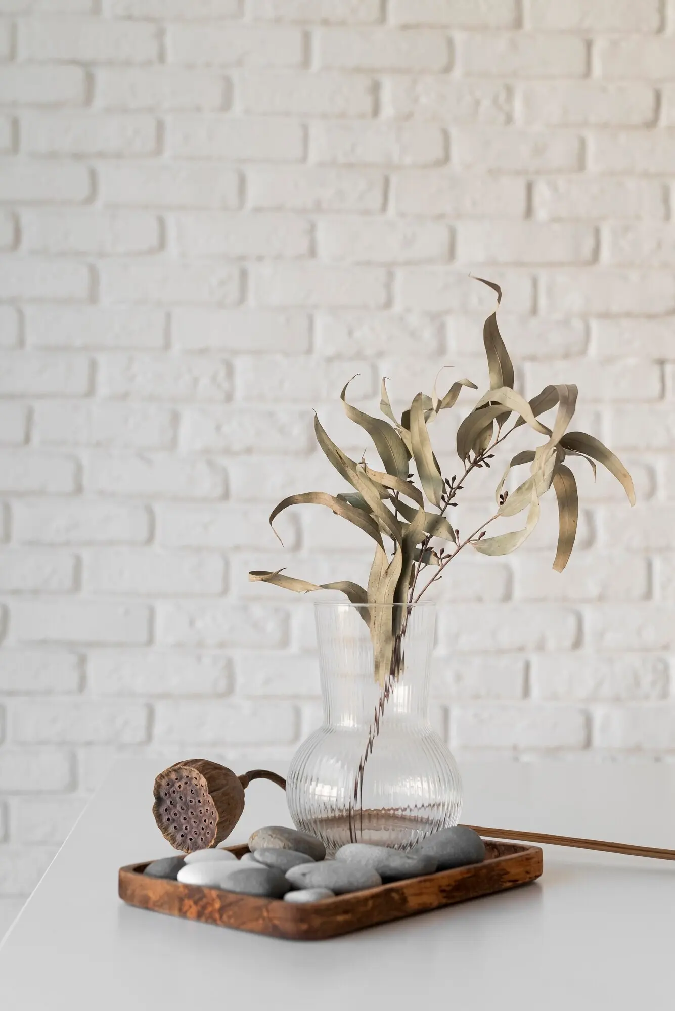
Coffee Table Vignettes with Purpose

Build height with stacked books, introduce sculptural forms, and add a living element like a clipped branch. Keep a tray to corral small items and simplify tidying. Repeat one color from your wall arrangement for cohesion. Rotate in seasonal objects to refresh energy without buying new. Leave breathing space for mugs and elbows so the arrangement remains generous, practical, and genuinely livable daily.

Shelves with Negative Space

Resist filling every gap. Negative space is a design tool that allows special pieces to sing. Stagger heights, layer a small framed drawing before books, and balance horizontal stacks with vertical lines. Use book jackets as color fields. Add a subtle metallic accent for sparkle. Step back often, photographing shelves to catch clutter you overlook in person, then edit until the cadence feels calm.

Textiles as Soft Frames

Pillows, throws, and rugs can frame art indirectly by echoing shapes and hues. A patterned kilim might repeat the geometry of a print, while a velvet pillow deepens a painting’s midnight blue. Mix textures—linen, wool, silk—to keep surfaces engaging. Rotate covers seasonally to protect fabrics and refresh the scene, maintaining continuity with wall pieces so updates feel deliberate rather than random.

Care, Rotation, and Storytelling

Collections evolve. Giving pieces rest preserves them, keeps the room dynamic, and lets new finds enter gracefully. Caring for materials and recording provenance turns affordable purchases into cherished artifacts. Equally important, sharing the story invites guests to connect, respond, and maybe start collecting themselves, creating a supportive orbit of curiosity, creativity, and community around your living room’s growing constellation.
Lixufovomazipehumo
Privacy Overview

This website uses cookies so that we can provide you with the best user experience possible. Cookie information is stored in your browser and performs functions such as recognising you when you return to our website and helping our team to understand which sections of the website you find most interesting and useful.